
Summary
For projects with small budgets, designers can use a growing number of free resources to deliver great work to their clients. These resources allow designers to focus their energy on more challenging tasks.
New IntoWine design.
The story of Into Wine
Into Wine hired me to create a responsive design of their existing site without changing any of the structure. The site is all about...you guessed it...wine. It generates revenue through an SEO/ad model, driving users to the site via search. Google now downgrades search result rankings for sites that are not responsive, so the site needed to change to get it's rankings back up.

Old home page of IntoWine.
The budget was small. I had 26 hours to do the project. URLs needed to all remain the same. 301 redirects were not allowed. The site had 237 menu items going as deep as 4 levels, with some sections having more than 50 menu items. Most of the design challenge was straightforward, but showing 50+ menu items going 4 levels deep would require creative problem solving.

The old vertical fly-out menu structure would not work on responsive. A new solution was needed.
The goals
The primary goals were:
- Make the site responsive
- On article pages, display 2 prominent ads, 1 above the fold
- Solve the navigation problem
Within these goals, I needed to be mindful to create designs that would not blow the development budget. Meaning, it couldn't be hard to create in Drupal, which is what the site would be built in.
Research
I did a content inventory and made a sitemap to understand the whole site. I discovered that there were 6 tricky areas of navigation. These sections had too many sub-nav links at a deep level to use average navigation solutions. To save budget, I made a plan to solve them all with the same design.
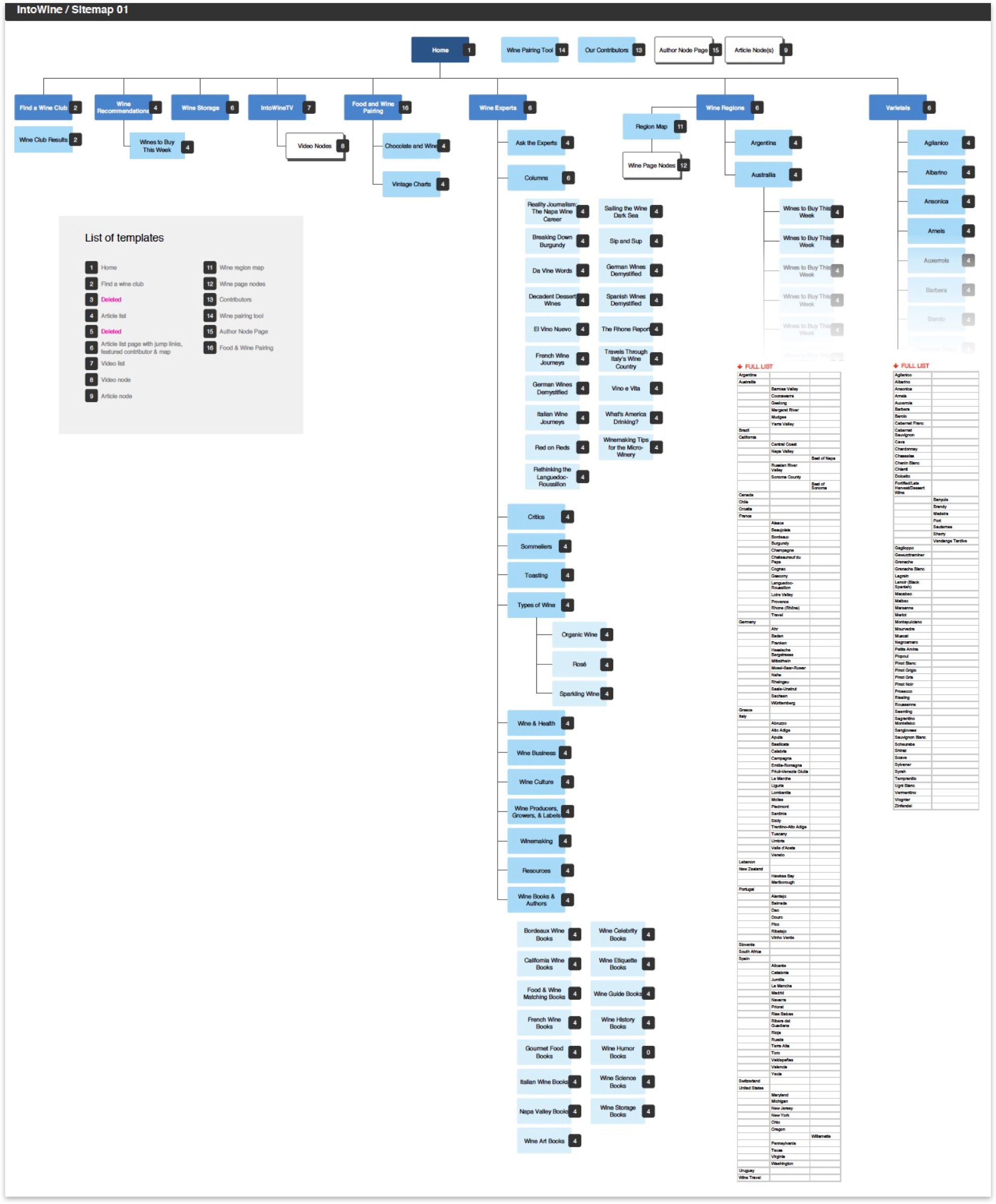
Into Wine sitemap.
For secondary navigation, I designed mega menu. This showed as few as 2 and as many as 50 menu items. 3rd and 4th level menu items would not be surfaced here.

Mega menus drop downs span the full width of the page. Sections with many items display in columns.
For 3rd and 4th menu level items, I designed landing pages with jump links. Visitors can quickly see all of the sub-pages within a section. The design looks a bit like a sitemap.
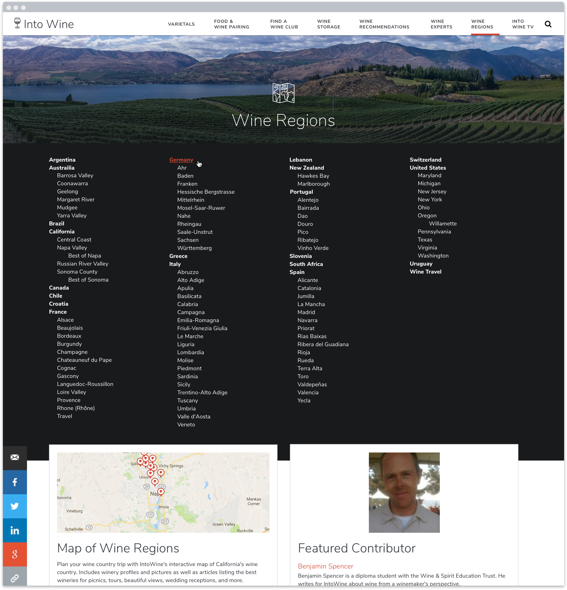
This design was used for 6 different pages on the site, all having extensive sub-categories.
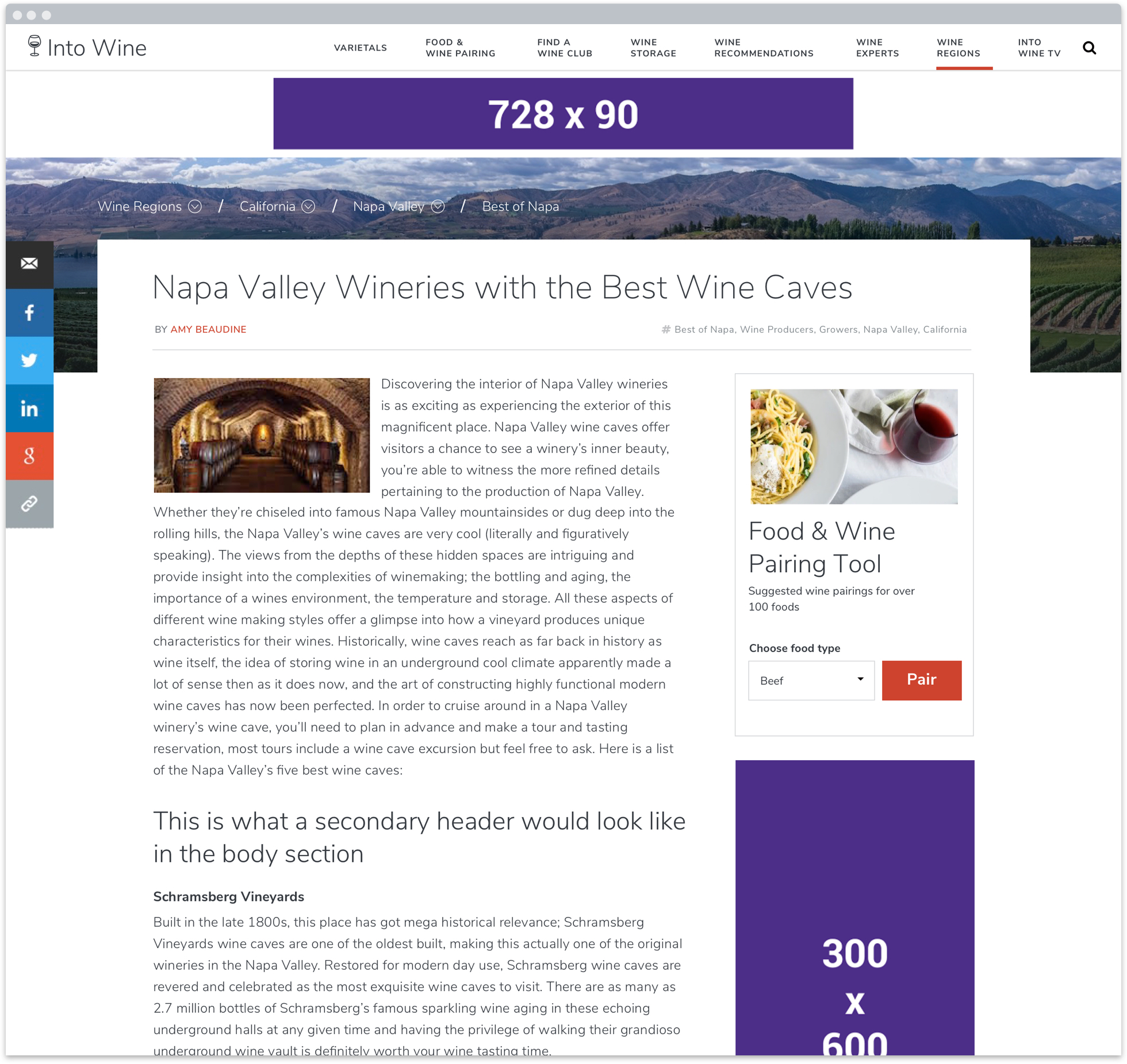
To provide a path up, down or horizontally within a menu tree at deeper site levels, I referenced a design I saw on Lonely Planet years ago. They had breadcrumbs with drop down menus. Visitors could navigate up the menu tree or horizontally within the menu tree. For pages with children, a drop down next to the page title provided a path deeper through the menu tree.

Breadcrumbs orient the visitor where they are in the site. Dropdowns show child pages, both on the breadcrumbs and page title.
Visual design
I wanted to the create a clean and elegant design. To do this, I used some of the free resources I mentioned at the start of the blog.
Photography
The existing site had no high quality photos. I used Unsplash to source hero images for primary sections. Unsplash provides free high quality imagery to use with no attribution. I found hero images for all pages except one. I used Flickr searching with the Creative Commons filter to source the last image. With proper attribution, Flickr photos can be used on many sites.
Pro tip
Unsplash is a fabulous resource for sourcing beautiful images. But, be aware that other designers will use these as well. If you are working for a client who is looking to be unique and distinct, this may not be the best option.

Hero image sourced from Unsplash.
Iconography
I almost never design a site without using Font Awesome or the Noun Project. For this project, I chose trendy outlined icons to reinforce the content of the landing pages. They provide extra information scent to orient the reader. The Noun Project icons can be used for free with attribution purchased for a small fee.

Hero images sourced from Unsplash. Icons sourced from the Noun project.
Typography
To update the typography, I chose Nunito Sans from Google Fonts. It is a well balanced typeface that conveys a classy tone. Google fonts offers a rich library of free typefaces and is a valuable resource for all web professionals.

Varietals landing page design.
New logo
I could not use the existing logo with the new design. They did not match, and it would decrease the quality of the site. I designed a logo that harmonized with the new look and feel. The wine glass icon served an additional function, displaying as the favicon for the site.

Color refresh
The site needed to entice visitors to to read articles. I designed the palette to encourage this task. I chose black and white as the primary colors with burnt orange as the accent. This produced a clean look and feel, with the typography taking center stage. The burnt orange is more refined than the previous red, embodying an earthy sophistication.
Example of article page design.
Responsive designs
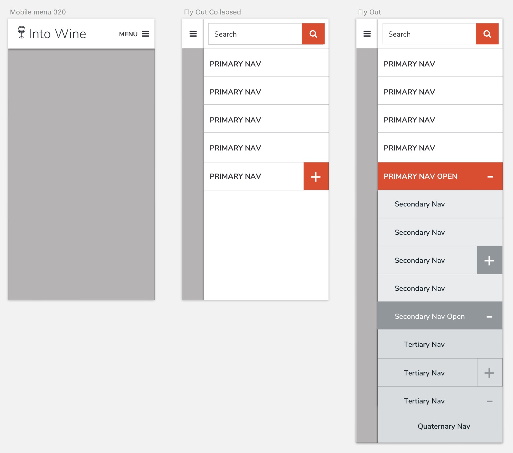
You'll notice that I haven't shared any responsive design comps so far. There is a reason. To modernize the site, I had to design fresh layouts that were responsive friendly. This process began with desktop. The designs I've shared follow standard patterns that reflow easily on any device. To ensure the intended responsive behavior, I met with my awesome development partner to hand off the project and explain how things should work. We looked at different patterns and reference past projects for how elements should reflow at different browser widths. This method helps conserve budget and works. The only thing I delivered was a comp for the mobile menu shown below.
Take aways
When working on a budget, I look for ways to deliver the greatest value within the hours. I rely on free resources and past project solutions to free up my time to focus on the most difficult problems. These are the resources I regularly use:
So how long did it take?
This project took me about 40 hours. I was only given 26, so I went over, but I wanted to do a good job since my client was super nice. In the end he was happy, which is the ultimate goal of any project.
"Nica these designs are fantastic. Very well done. I have no comments or edits and am so pleased."
– Brad Prescott
Can I see the site?
The site is not live, yet. However, if you'd like to take a peek at the full set of comps, you can view them here on Marvel.