YMCA San Francisco
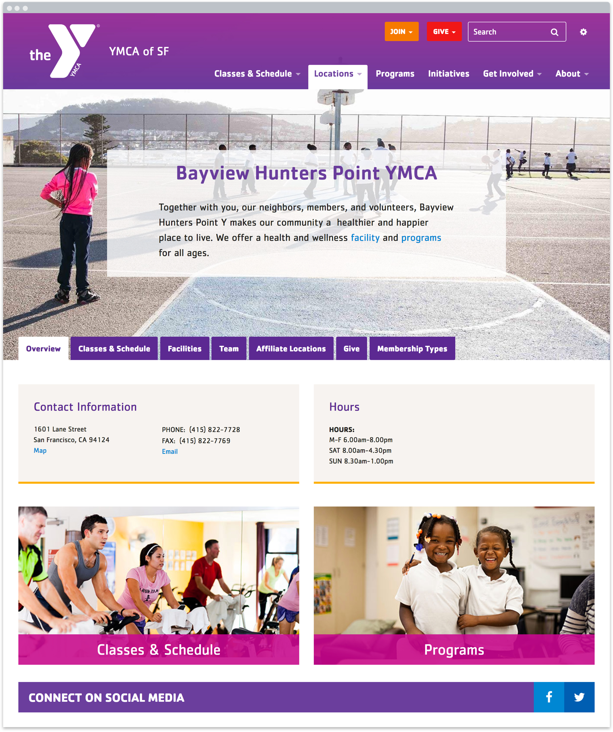
15 sites, 1 design
Results
- 516% increase in online joins
- 110% increase in page views
- 30% increase in unique visitors
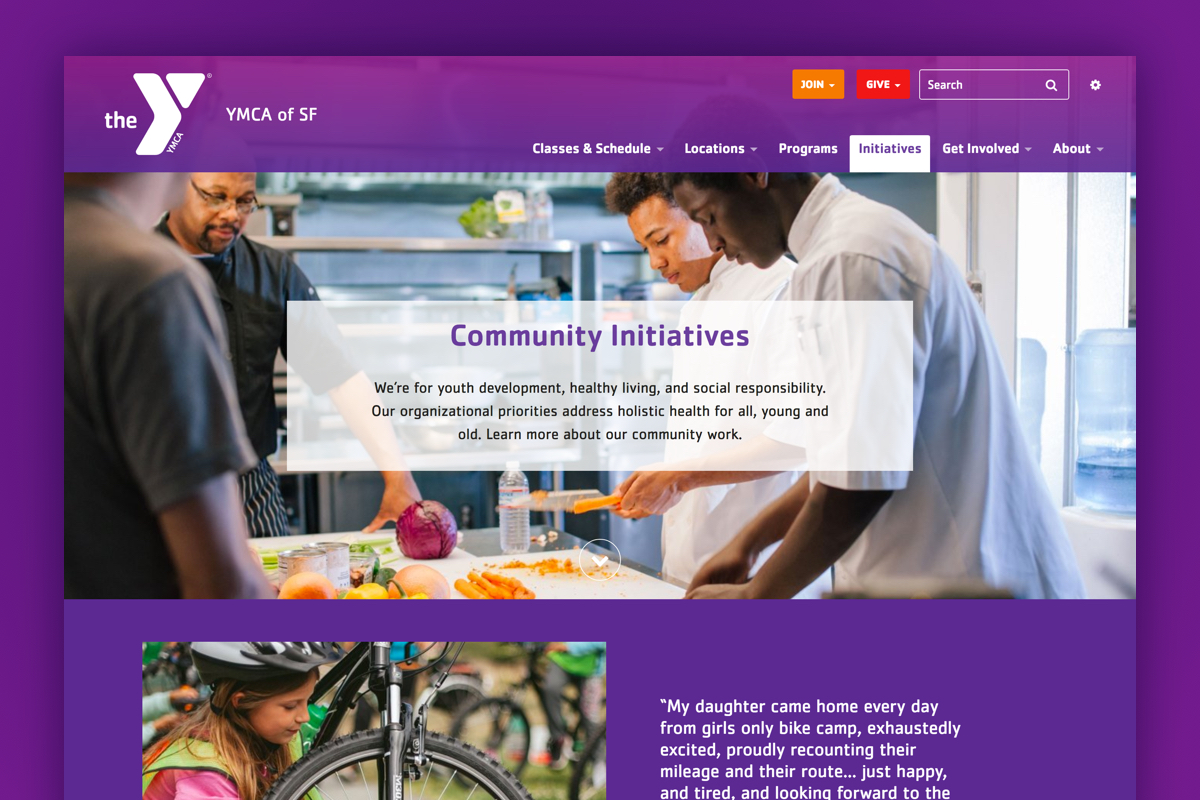
The new YMCA website tells a story of positive community impact. The new membership model is mirrored in the site structure, making it easy for members to find what they need.
Highlights
- Created a branch design that supports content variability
- Built a flexible and unified design system
- Developed training materials to support less technical site authors
- Led content strategy and training for blog
- Extended the YMCA brand to work with responsively
Services
- Strategy
- Creative direction
- Content strategy
- Information architecture
- User experience design
- Responsive design
- Digital Brand Extension
- Training
This work was done at Chapter Three with input from my design team and in collaboration with Claire DeLeon from YMCA SF.
"Nica’s expertise in strategy is evident from her fantastic results; her leadership on the Y of SF website build made the project fun, efficient and very effective. I am sure that to work with Nica is to learn from her, because her talent in both creative direction and business strategy is unique and awe-inspiring.
What I appreciated most about Nica’s approach, aside from the joy it was to work with her, is that she balanced practical and attainable with inspiration and dreams; her influence inspired ongoing learning and higher standards of quality in our teams. Working with Nica was truly a gift; she was supportive beyond my expectations throughout the very successful project."
–Claire DeLeon, MPH /Director of Marketing and Communications


